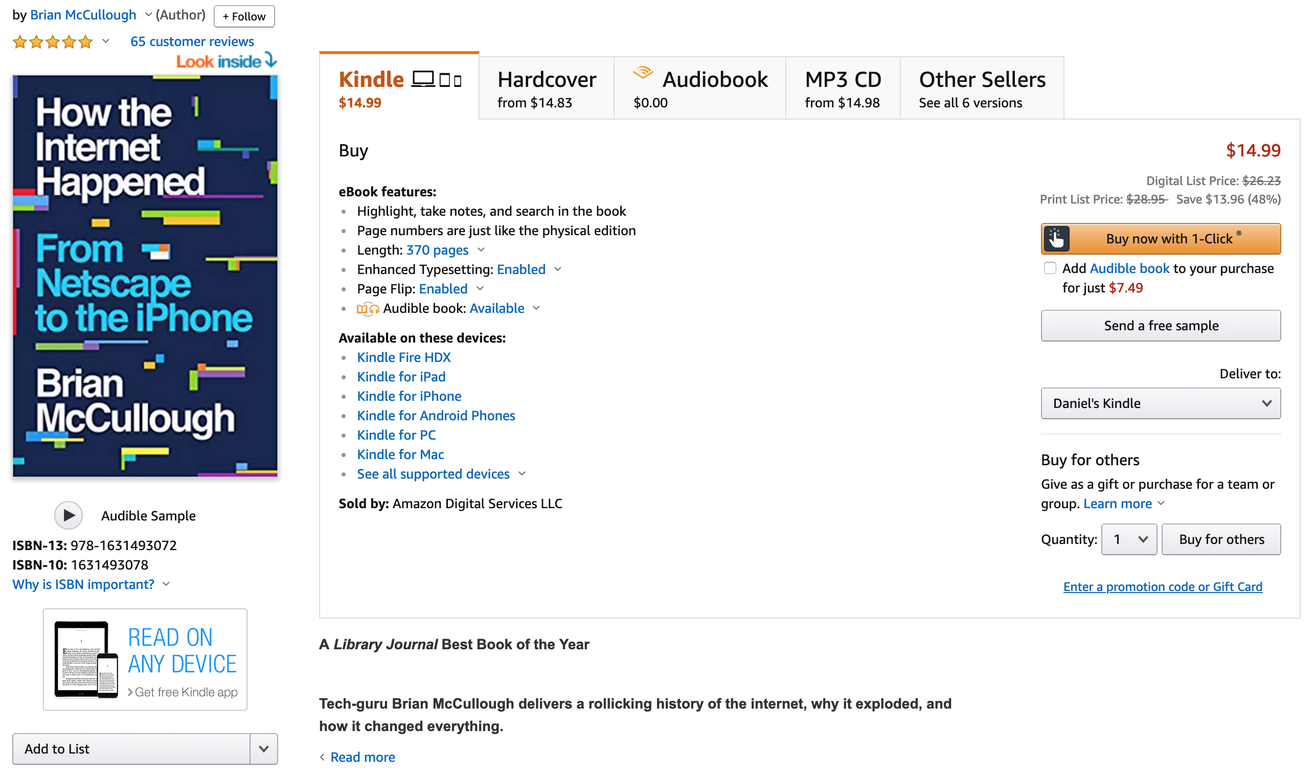
I use Amazon’s wish list as a placeholder of books I plan on buying. I’m not sure why I don’t just buy them immediately but whenever I’m done with a book I go to my wish list and purchase a new one. Earlier today while adding two books to my wish list I noticed something odd: the location of the “Add to list” button was different from one page to the next. Amazon is the premier ecommerce company and must be doing a ton of A/B testing to optimize the design of the site so it’s surprising that the button is in two completely different locations. I was in the same browser session as well so it’s not as if they’re randomizing it per session; instead it’s as if they’re just showing me two completely different designs for two different products.
I’ve included the two screenshots below as proof but you might be able to reproduce it by comparing the pages of the two books: The Airbnb Story and How the Internet Happened. Maybe I’m the rare user who actually uses the list functionality and it has minimal impact on the customer experience but I find it odd that there’s no consistent place for the “Add to list” button.


