Over the past year I’ve been collecting a bunch of statistics for each of my days in the hope that I’ll have time to dig into them and discover some interesting patterns. Unfortunately I haven’t had a chance to do anything other than some simple visualizations but even these provide some insight into my 2017. This isn’t a wholehearted adoption of the quantified self movement but it’s something I am interested in and hoping to expand in 2018. A goal has always been to move beyond visualization and into actual analysis and actionable insights that can help me improve my lifestyle and behavior. I did the same set of visualizations in 2016 so it’s useful to compare them year over and year and see how, and if, my habits have changed.
Just under 7.5 hours of sleep per night but a bit all over the place.
Daily consumption of coffee, tea, alcohol, and soda box plot. Compared to last year the numbers are pretty similar although I did manage to cut down slightly on both my alcohol and coffee consumption - something that I made a concerted effort to this year. Unfortunately the change wasn't as significant as I had wanted to and is a goal for 2018.
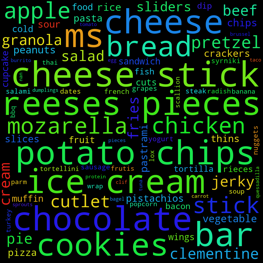
A much wider breakfast range than last year yet still a bit heavy on the cheese.
An improvement over 2016 where I was very much into Chipotle. I still enjoy my burrito bowls but have also introduced salad to the mix.
Very similar dinners to last year - still heavy on the salad, chicken, and rice.
The most disappointed of the wordclouds and something I need to drastically cut down on in 2018.