
In honor of the upcoming NFL season I thought it would be interesting to actually take a look at the scraped fantasy football projections and visualize it in a few different ways. The data contained the weekly projections for that week’s top 100 scorers which amounted to 1700 rows - note that this means the dataset only includes the top performers rather than every single player. I ended up using R since it makes it incredibly easy to process data and get some nice looking visualizations in only a few lines of code. As usual, the code is up on GitHub and I’ll keep updating it as I keep adding newer visualizations and analyses.
Pretty simple here but highlights how much more valuable the QB position is compared to the others.
The box plot is a quick way of looking at distributions since it highlights a few metrics at once - the median, the quartiles, as well the outliers. What's interesting here is how many outliers there are at the QB and WR positions, especially how uneven it is for WRs.
The density plot shows how the points are distributed by position. This shows a similar story to what we saw in the boxplot but visualizes each of the data points. I suspect the symmetry in the QB position is not unique and is just an artifact of the fact that QBs are heavily represented in the top 100 players each week and if were to expand our dataset we'd see similar distributions for the other positions.
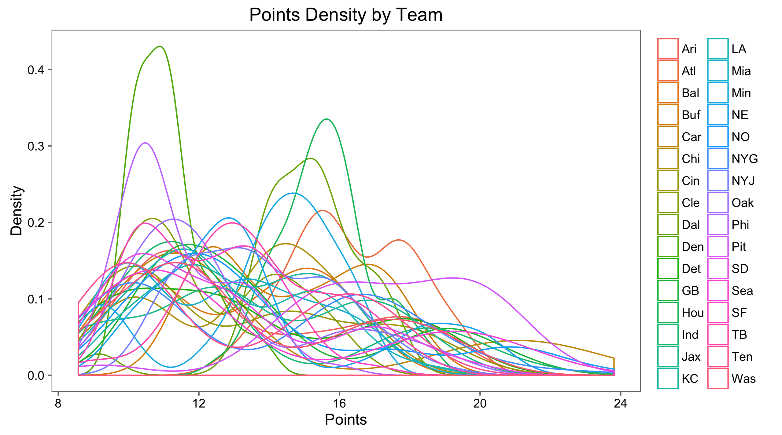
Similar exercise to the above but by team. I didn't find a ton interesting here other than Pittsburgh is dominant when it comes to top fantasy players and that Denver and Philadalphia are lacking.
This isn't the most useful due to the biased dataset but it does highlight the dominance of some teams compared to others but not much more than that - at least with a quick glance.
A bit tough to read due to the volume of teams but paired with the previous one does show that there are a few outliers but many of the distributions are similar.