
After getting the IMDB data loaded it was time to dive in and start looking at the data. In 2012, I did an analysis to examine the way actor and actress ages have changed over time. Unfortunately I did not have a large dataset and had to write a quick crawler to look at the top 50 movies during each decade. This time around, and with the help of CuriousGnu, I was able to get my hands on a much larger dataset. After cleaning and filtering the data I was left with over 208,000 unique actors (~65%) and actresses (~35%) spanning over 371,000 movies. The code is up on GitHub and contains both the queries used to pull the data from MonetDB, the R code to generate the charts, and a small script that generated the animation below. If you have suggestions or ideas definitely let me know.
A replication of CuriousGnu's chart as a sanity check to make sure the data was loaded correctly. As one can guess, actresses skew younger compared to actors with an average of 34.6 compared with 41 for actors.
The previous chart examined the distribution across the entire date range but we can see how this shift occurred over time. Before the 1940's actors and actresses were much closer in age. Another interesting point is that both actors and actresses have been getting older on average. One theory is that this is a function of the movie industry being new at the beginning of the 20th century with very few actors and actresses at the start that have aged along with the industry. Another reason may be lack of accurate data prior to the 1940s in the IMDB dataset which skews the results toward more recently-born actors and actresses.
Similar to the above but focused on actors and actresses that have appeared in at least 100 movies. The goal here was eliminate some of the noise and focus on the high volume actors and actress. This tells a similar story to the previous chart.
Combining both the distribution and trend over time we can look at the distribution changes over time. This also highlights the bias in the early years - in the 1920s it looks as if no one was older than 30 according to the IMDB data. After some digging around it's due to the lack of birth dates for many of the early 20th century actors and actresses. For example, for movies produced in 1920 we have close to 19,770 actor/actress movie combinations but only 1,060 (~5%) with a birth date. For 2010 the respective numbers are 269,645 and 52,262 (~19%). This causes our distribution to look heavily truncated but ends up correcting itself once we get into the 30s and 40s. In this case the average ages are inaccurate until the 1940s but I suspect the relationship between the genders still holds.
This is just a timelapse of the data above that makes it much easier to see the shift of the average actor getting older at a faster pace than the average actress.
In addition to birth date the data also contained the height so I decided to have some fun and see how that looked. This is just a plot of actor and actress height by year of production. My takeaway is that actor heights stayed roughly flat while actress heights have been increasing. Note that since I only had a single height for each person this wouldn't be able to accurately represent children growing up but I imagine those are a small fraction and wouldn't influence the results.
This is an interesting one. Instead of looking at the heights by movie production year this examines heights by birth date of the actor and actresses. In this case we see that actors have stayed roughly the same height while actresses have increased in height over time. There's also a huge looking drop at the end - going from a bit over 70 inches to less than 65 for actors and from 65 inches to less than 63 for actresses. This drop off is in the late 90s which also indicates these are teenagers just growing up.
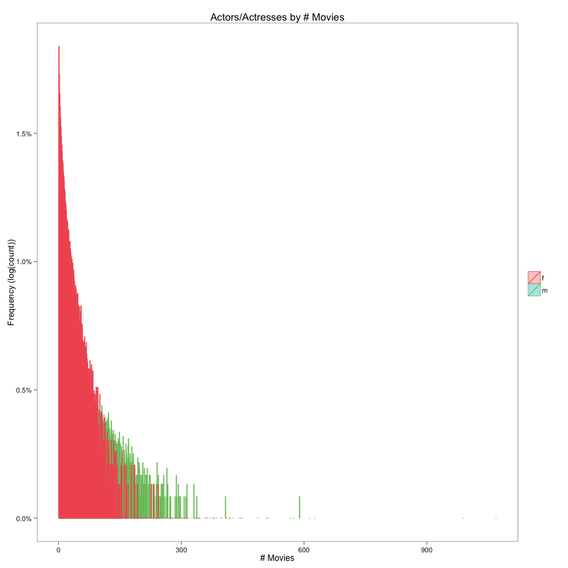
For the last one I wanted to get a sense of whether actors are more likely to be in more movies than actresses. The chart here is a bit tough to read but it looks at the distribution of actors and actresses by the number of movies made. in this case the scale was massive since there were tons of people who've only been in a few movies so I had to normalize by taking the log. The effect is subtle but the fact that the tail for actors goes wider than the tail for actresses indicates that an average actor is more likely to appear in multiple movies than the average actress.