
This is a bit of a first-world problem but it’s possible for a design to be too good. A great design may lead to an increase in your vanity metrics but that won’t necessarily translate into a successful business. In fact, it’s likely that these low-value users will increase your costs.
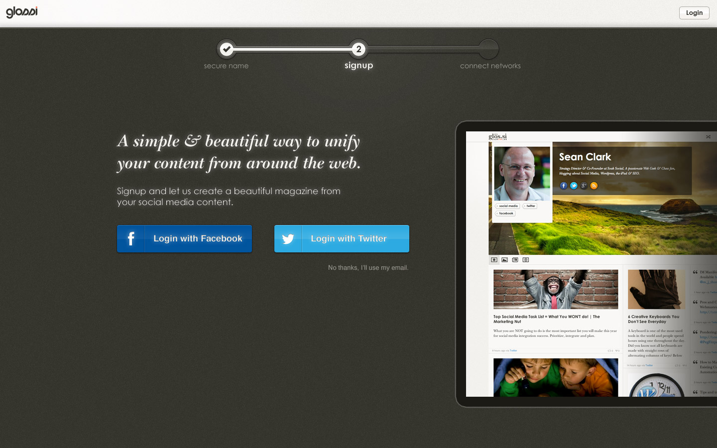
When we redesigned the landing page for Pressi (formerly Glossi) we saw the signup rate from our landing page shoot up to to close to 34% from below 5%. Unfortunately, our retention rates were abysmal and we were stuck supporting thousands of Pressi pages that were not seeing any engagement. This led to a massive increase in our AWS costs that we had to scramble to contain. The solution was to be smarter about the frequency of our data pulling as well as minimizing the amount of data we were storing for our users. In hindsight, we should have solved our retention problem before trying to grow our users but we were too obsessed with our user growth numbers to do the right thing.
I realize that user growth is a problem that many startups would love to have and that it’s foolish to choose a crappy design over a great one. At the same time, if you’re not tracking the metrics that align with what you’re trying to accomplish, a surge in growth will be more damaging than beneficial. The corollary to this is that if your design sucks and yet you’re still getting signups then you must be onto something.
For those interested, here’s the signup flow that had the ~34% signup rate. The awesome design work was done by Marc.
The Pressi landing page
Pressi signup step two
Pressi signup step three