
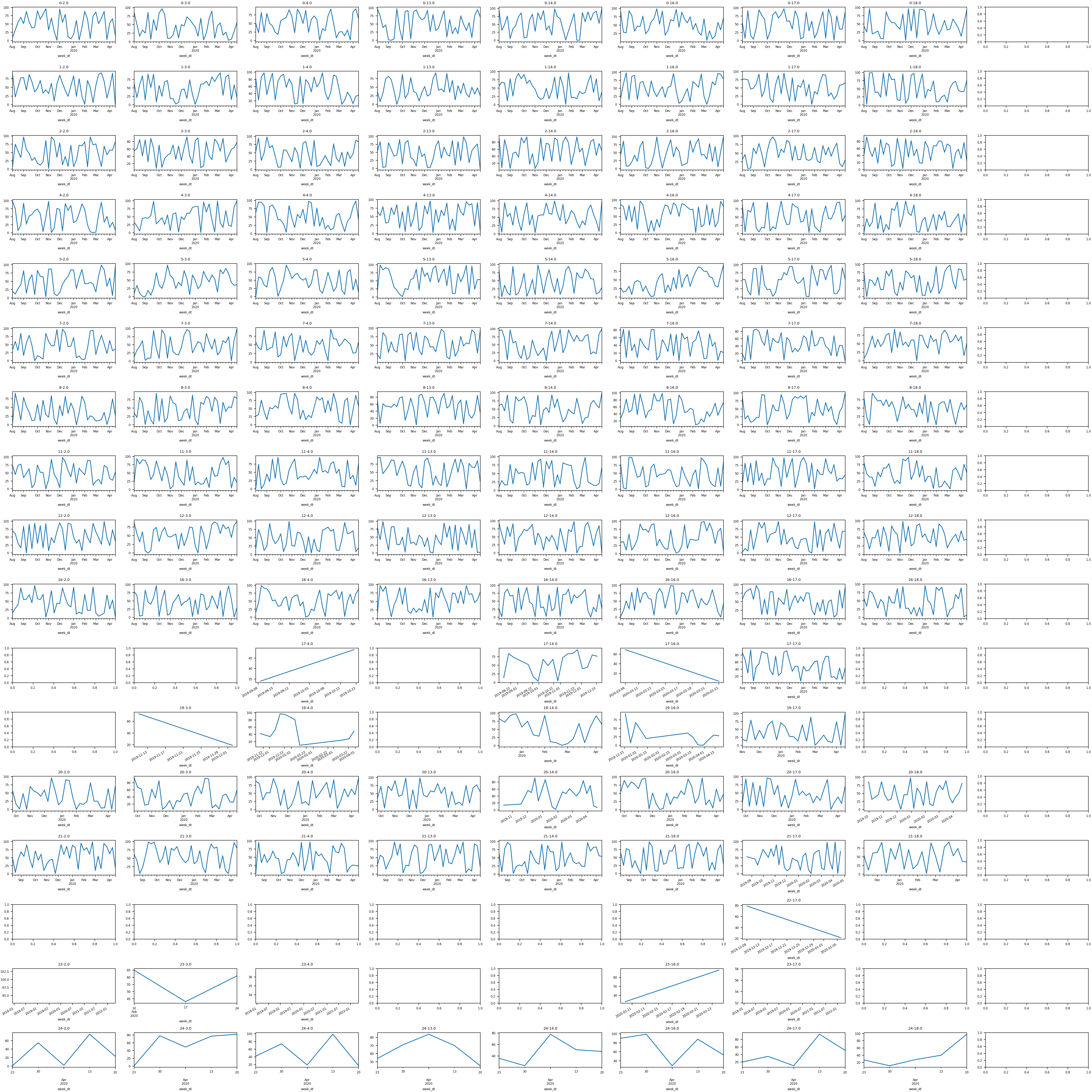
Yesterday I had the rare chance to actually do some coding and realized how rusty I am at numerical analysis in Python. The task was simple - ingest a CSV that had a date column, two categorical columns, and a numerical column - and then generate a grid containing a series of line plots, each of which would be a combination of the two categorical columns.
I did a ton of this work years ago so knew what was possible. That’s half the battle and after a bit of searches I got a working solution. At the same time I’m disappointed it took me that long, especially after seeing the brevity of the end result. Software ate the world and now every business is generating tons of data. Being able to make sense of it is an increasingly important skill set especially if you’re a leader. It’s unfortunately an area I haven’t kept up with over the years and something I plan on remedying after this experience.
I also couldn’t help but be inspired by rt.live, if the founders of Instagram have both the skillset and the inclination to do data work it’s a good indicator that there’s something there.
import pandas as pd
import matplotlib.pyplot as plt

plt.rcParams.update({'font.size': 6})
plt.rcParams.update({'figure.figsize': (30, 30)})

df = pd.read_csv('weekly-dim1-dim2.txt')

# Fix up dates
df2['week_dt'] = pd.to_datetime(df2['week'], format='%Y-%m-%d')
df2 = df2.sort_values(by=['week_dt'])

# Get unique vals
dim1 = sorted(list(df2['dim1'].unique()))
dim2 = sorted(list(df2['dim2'].unique()))

plt.tight_layout()
fig, axes = plt.subplots(nrows=len(d1), ncols=len(d2))

# Generate plots per dim1 and dim2 combination subject to data and threshold
for i, d1 in enumerate(d1):
    for j, d2 in enumerate(d2):
        x = df2[(df2['dim1']==d1) & (df2['dim2']==d2)]
        if len(x.index) > 0:
            x.set_index(['week_dt'])['num'].plot(ax=axes[i,j])
            axes[i,j].set_title(str(d1) + '-' + str(d2))

plt.tight_layout(pad=0.4, w_pad=0.5, h_pad=1.0)
plt.savefig('out.png', dpi=200)