
For the past few years I’ve been tracking a variety of daily metrics - ranging from sleep, to what I eat and drink, to my mood - in a Google spreadsheet. I have an annual tradition of analyzing and visualizing the data but I never go beyond the simple summary statistics. I always mean to do a deeper analysis but inevitably just run a script I barely touched in the past few years.
At the same time, I keep seeing the prompt from Google Sheets to try out their new “Explore” functionality so I decided to give it a shot and see if surfaced any interesting insights. It’s extremely simple to use and if you know what you’re looking for a great way to quickly get answers and visualize your information. For example, typing in “Histogram of Time Slept” gets you a plot containing exactly what you wanted.
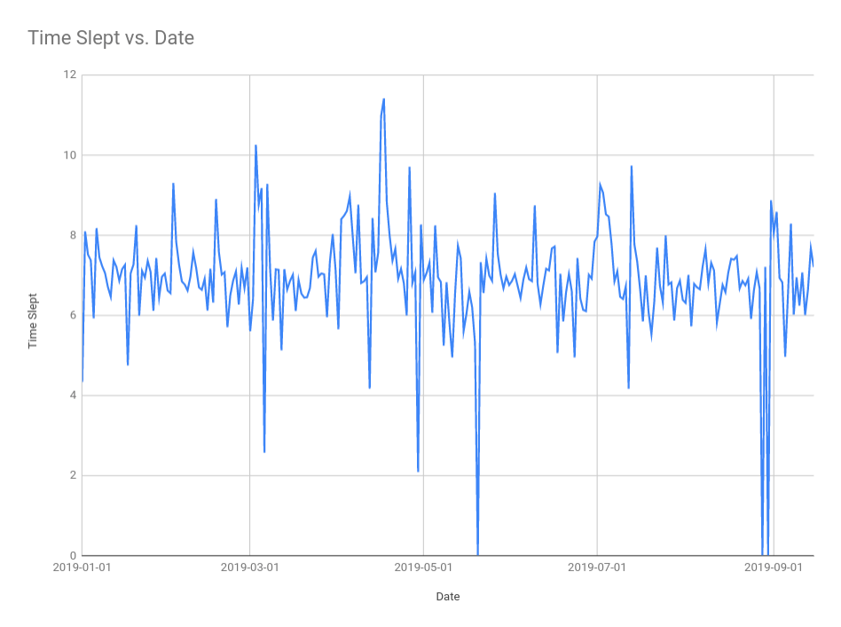
The above made it easier to get what I wanted so I had high hopes for the “Analysis” functionality which I hoped would surface something novel. Instead, it seems it just ran through all the data and chose the appropriate chart depending on the data type and cardinality. For example, it generated the time slept histogram above but a pie chart for my moods.
Part of the challenge is that most of the interesting data is semi structured and I’d need to do a variety of transformations to make it easier for Sheets to work with. Overall, I’m impressed with how simple and quick to do the visualizations but also disappointed in the depth of the analysis.