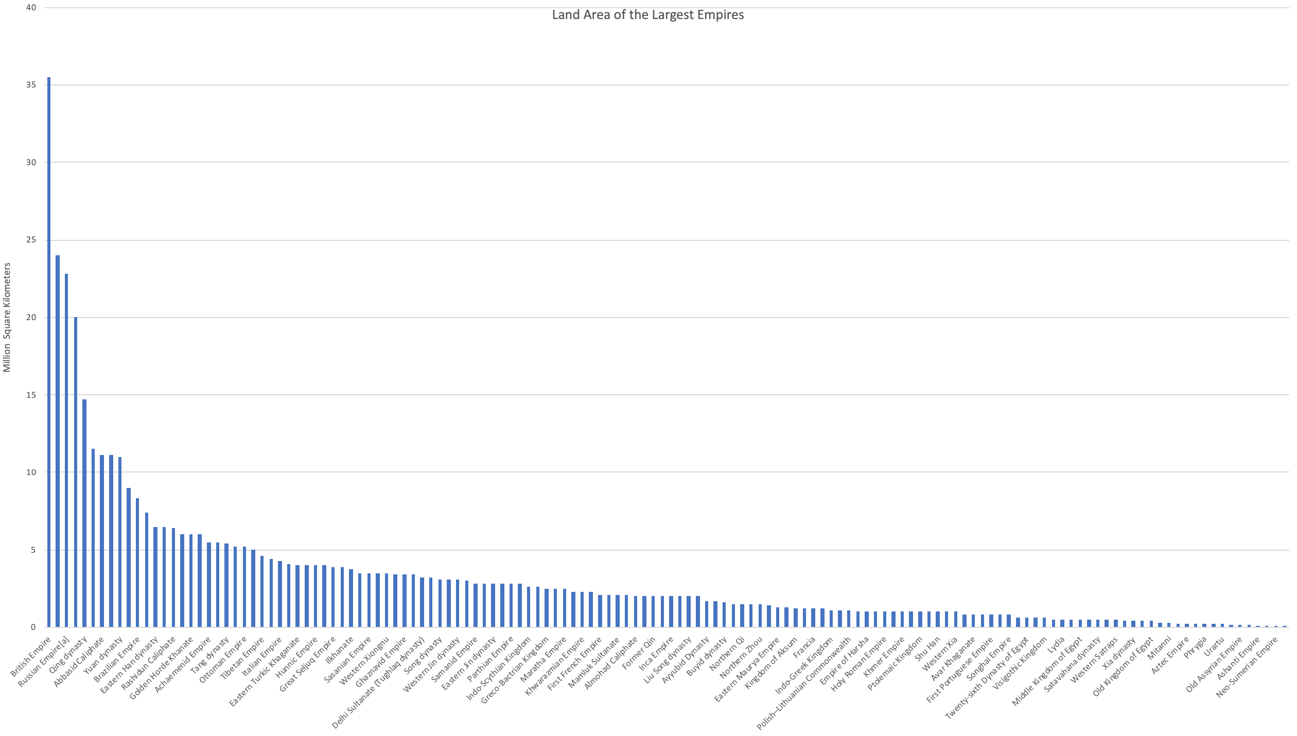
I got a bit distracted today and ended up coming across the Wikipedia page listing history’s largest empires. The page came with a list of the top 140 by land area and just by looking at them you can see there’s a huge range. The British Empire was the largest at 35.5 million square kilometers while the Sumer was the smallest at 0.05. That’s a huge difference - over 700 times - and I thought it would be interesting to plot them to visualize the distribution. As expected, there’s a very steep drop and a long tail. If you add up the land areas of all the empires listed you get just over 455 million square kilometers. That metric itself doesn’t mean anything but it helps to normalize the land areas. The British Empire, for example, is 8% of the total and if you keep going down the list in descending order by size and sum up the percentages you get that the first 55 empires add up to 80% of the total land area. Once again, the total land area is useless metric but it allows us to see how close we are to the 80-20 rule. It turns out not too close - 55 countries out of 140 are just over 39%. The top 20% empires add up to 52% of the land area. If you’re interested in playing around with the data it’s up on the Wikipedia page as well as an Excel version with cleaned up data.

