
I’m a sucker for subtle UX gems and Google continues to amaze me. While working on a presentation using the Slides product I had to modify the colors of a few objects. The UX for this is usually pretty normal - you select the object, hit the icon to modify the color, and choose a new color. Usually it’s slightly better and you get to see the existing color. What surprised me with the Google Slides experience is that I didn’t just see the existing color but also saw the previously picked color. Since I was modifying a series of objects to the same color this was a pleasant experience, especially since I was working off of a series of color shades that looked too similar. It would have been even better if I was able to bulk change the objects but a win’s a win.
I’m convinced that this sort of UX behavior only happens by users who eat their own dog food. It’s unlikely that someone who was not a regular Slides could have come up with a feature like this since it’s so subtle and baked into the power user experience. In addition, that person must have been aware enough to realize what they were doing and took a step back to think of this functionality. Or maybe it wasn’t a person at all and Google’s tracking is so sophisticated that it was able to suss out this pattern and bring it up to the relevant product manager who was able to identify the behavior that needed to be optimized. Both of these cases are extremely impressive and I can’t wait to find more of these subtle UX optimizations.
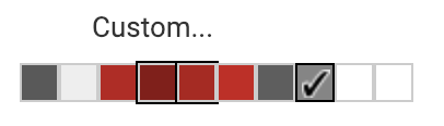
Google Slides previous color selection