Last week, the New York Times ran an expose on the massive amount of follower fraud happening on Twitter. Unsurprisingly, when you can buy tens of thousands of followers for a few thousand dollars it’s not very likely that they’re going to be real. Anyone who has used Twitter for even a nominal amount of time would have quickly discovered that there’s a rampant amount of bots. Some leave cryptic comments, others like and retweet, while others follow; most do all of the above.
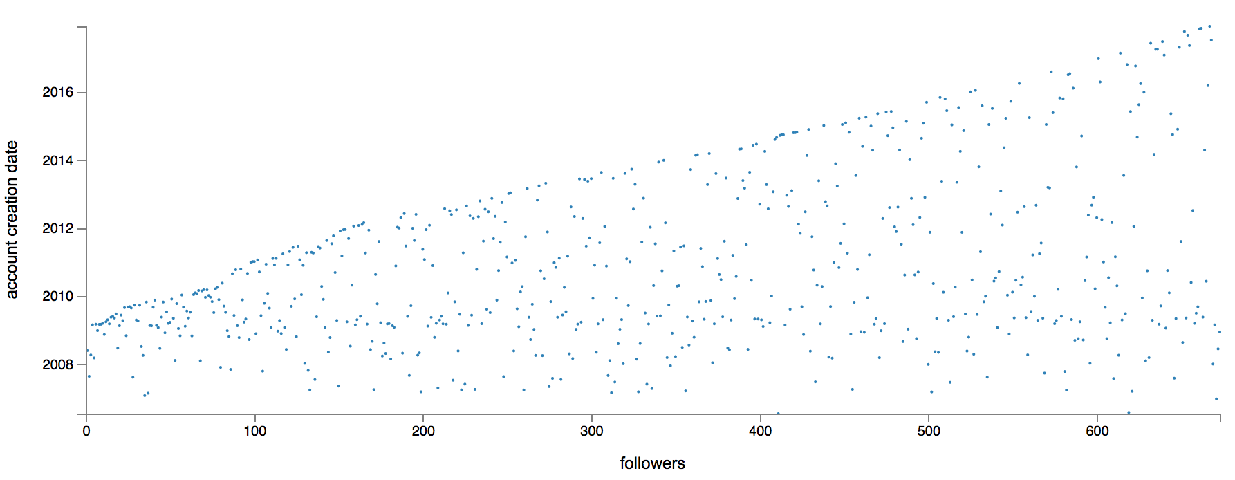
One of the cool ways they explored these fake followers is by plotting the growth of followers over time. Each point is a follower with the x-axis showing what number follower they were and the y-axis indicating when they joined Twitter. The idea here being that if you see a stretch of new followers that all joined Twitter at roughly the same time they’re likely bots.
This was a pretty cool way to look at it and one of my friends, Geoff, shared an open source script that would pull and plot the data. I ran it for my meager, but amazing, 680 Twitter followers and am happy to report that there’s no obvious fraud pattern.

