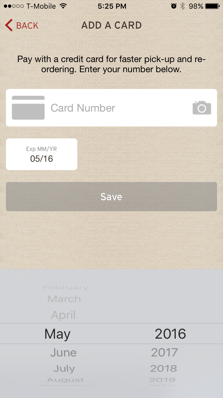
Wanting to avoid a busy lunch rush but hankering for Chipotle I decided to download their app to order ahead. It’s a straightforward app and everything went as expected until I had to enter the expiration date for my credit card. The way the app is set up is that you’re expected to choose the month first followed by the year. Unfortunately it prevents you from picking a month in the past. One can probably guess what problem this leads to: if the expiration date is in the future but the expiration month is before today’s month the app rejects the month change until you change the year. The screenshot illustrates the design.
I tend to be more passionate about usability issues than most - especially ones that are obviously wrong and trivial to fix. I suspect in this case in the desire to make the user experience better by not allowing a user to select a date in the past it actually had the opposite effect and decreased the usability.
