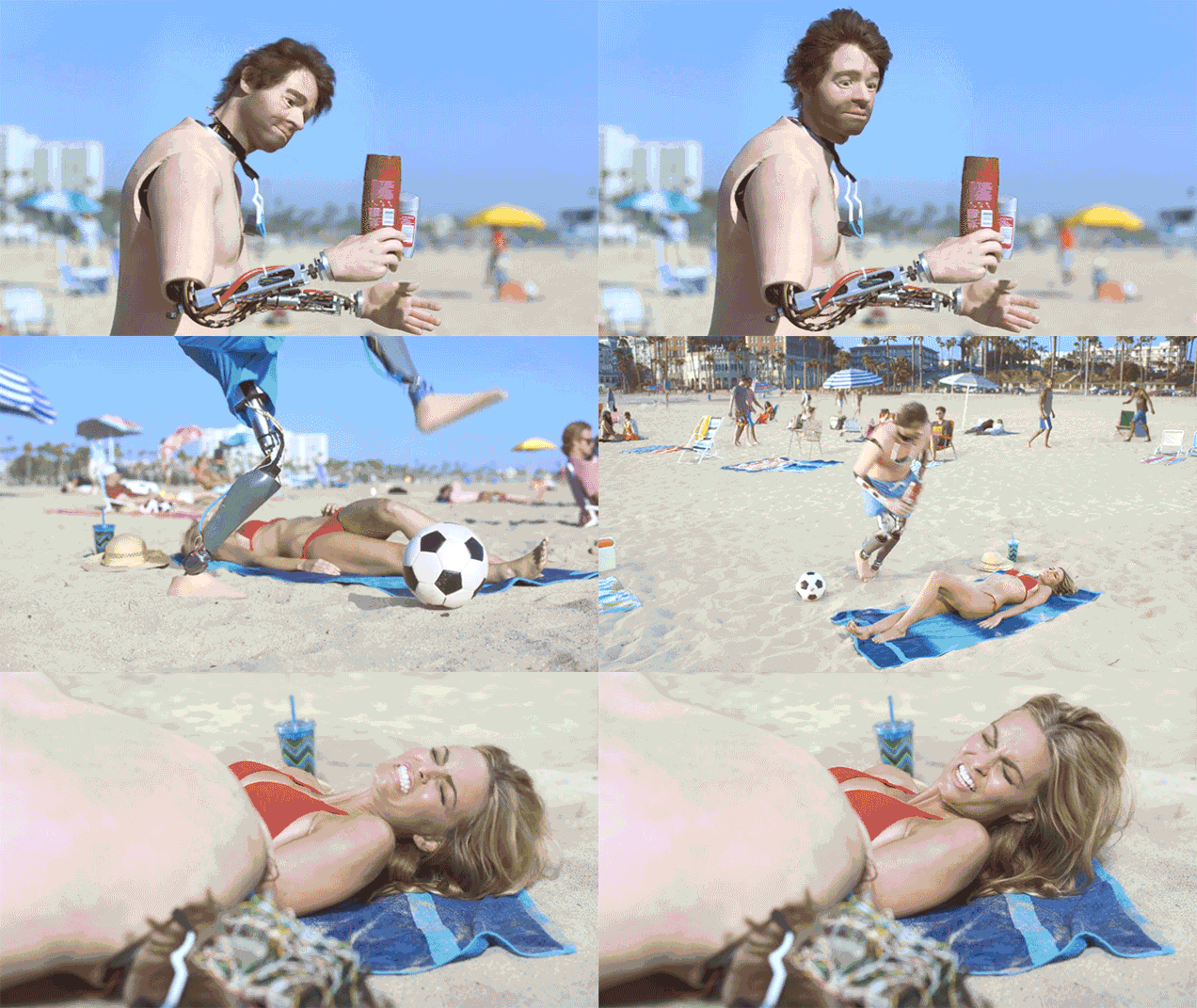
Old Spice ad mocking the uncanny valley (Credit: Gizmodo)
The uncanny valley is this idea that although we keep getting better at depicting people through technology, a few small kinks ruin everything and make people feel repulsed compared to an obvious imitation. Another way to explain it is that we’re a lot more comfortable with cartoon characters that are obviously fake than pseudo-realistic video game characters that look real but have non-human behavior or expressions.
I think this also exists in advertising. I work at TripleLift which allows us generate ads that look and resemble a publisher’s website. This means that if a publisher’s site has a feed layout where each image is 300x300 with a particular font and typography we’ll use the same style for our ad. At the same time, we make it a point to include a “Sponsored” overlay, apply a brand logo, and redirect to the advertiser’s website upon a click. Our goal isn’t to obfuscate the ad but rather give a publisher an effective way to monetize their content without having to resort to traditional, distracting banner ads that take up the entire page and hurt the consumer experience. The goal is to complement the user experience by providing great looking ads that are relevant to the audience.
It’s likely we’d be able to increase short term performance if we start obfuscating the fact that it’s an ad but in addition to being immoral it will fall into some form of uncanny valley. People aren’t stupid and will see something’s off if an ad is pretending to be content. The end result benefits no one and sets advertising back. The site visitor is pissed off by the experience, the publisher loses integrity, and the advertiser may get better vanity metrics without deriving any value. Native is a much better ad format when done right but it comes with risks that need to be properly handled by the industry or we’ll end up with a depleted field.
