
I initially set out to add some visualizations to an earlier post comparing taxi fares between NYC and Mumbai based on some reader suggestions. After a few visualizations, I wasn’t discovering anything new and decided add taxi fare data from other cities to make it more interesting. I ended up simulating rides in different cities on worldtaximeter.com and combining that with the data from taxiautofare.com and www.numbeo.com in order to break down each city’s fare into a base fare, the included distance, the rate per local distance unit, and the rate per minute. Since each city’s fare came in local units I also had to convert to miles (sorry world) and US dollars (sorry again). Using R we generate the fares for the various combinations of distances and stoppage times and start diving into the data. As usual, the data and code are up on GitHub with contributions, corrections, and suggestions welcome. I’d also love to get the real rates for the cities so either do a pull request or let me know what they are in the comments and I’ll update the post.
| City | Base | Inc Dist | Per Dist | Per Min | Dist Cvr | Fare Cvr | $ Base | $ per Mile | $ per Min | Ratio | $ per Hr |
|---|---|---|---|---|---|---|---|---|---|---|---|
| New York | 2.50 | 0.00 | 2.50 | 0.50 | 1.00 | 1.00 | 2.50 | 2.50 | 0.50 | 5.00 | 30.00 |
| Mumbai | 19.00 | 1.50 | 12.35 | 0.50 | 1.61 | 0.02 | 0.32 | 0.33 | 0.01 | 39.77 | 0.50 |
| London | 2.20 | 2.00 | 1.70 | 0.52 | 1.61 | 1.64 | 3.61 | 4.49 | 0.85 | 5.31 | 50.71 |
| Amsterdam | 2.66 | 0.00 | 1.95 | 0.32 | 1.61 | 1.36 | 3.62 | 4.27 | 0.44 | 9.81 | 26.11 |
| Tokyo | 712.00 | 0.00 | 188.00 | 56.00 | 1.61 | 0.01 | 6.84 | 2.91 | 0.54 | 5.41 | 32.26 |
| Aberdeen | 2.40 | 0.90 | 1.10 | 0.37 | 1.61 | 1.64 | 3.94 | 2.90 | 0.61 | 4.79 | 36.41 |
| Austin | 2.54 | 0.20 | 1.30 | 0.67 | 1.61 | 1.00 | 2.54 | 2.09 | 0.67 | 3.12 | 40.20 |
| Baltimore | 1.80 | 0.15 | 1.36 | 0.44 | 1.61 | 1.00 | 1.80 | 2.19 | 0.44 | 4.98 | 26.40 |
| Barcelona | 2.05 | 0.00 | 0.98 | 0.38 | 1.61 | 1.36 | 2.79 | 2.15 | 0.52 | 4.15 | 31.01 |
| Berlin | 3.00 | 0.00 | 1.58 | 0.41 | 1.61 | 1.36 | 4.08 | 3.46 | 0.56 | 6.20 | 33.46 |
| Boston | 2.60 | 0.23 | 1.73 | 0.54 | 1.61 | 1.00 | 2.60 | 2.79 | 0.54 | 5.16 | 32.40 |
| Chicago | 2.25 | 0.18 | 1.11 | 0.37 | 1.61 | 1.00 | 2.25 | 1.79 | 0.37 | 4.83 | 22.20 |
| Dublin | 4.09 | 1.00 | 1.03 | 0.37 | 1.61 | 1.36 | 5.56 | 2.26 | 0.50 | 4.48 | 30.19 |
| Edinburgh | 3.00 | 0.52 | 1.20 | 0.36 | 1.61 | 1.64 | 4.92 | 3.17 | 0.59 | 5.41 | 35.13 |
| Ibiza | 3.25 | 0.00 | 0.98 | 0.35 | 1.61 | 1.36 | 4.42 | 2.15 | 0.48 | 4.51 | 28.56 |
| Las Vegas | 3.30 | 0.00 | 1.49 | 0.53 | 1.61 | 1.00 | 3.30 | 2.40 | 0.53 | 4.53 | 31.80 |
| Los Angeles | 2.85 | 0.18 | 1.67 | 0.50 | 1.61 | 1.00 | 2.85 | 2.69 | 0.50 | 5.38 | 30.00 |
| Madrid | 2.04 | 0.00 | 0.98 | 0.32 | 1.61 | 1.00 | 2.04 | 1.58 | 0.32 | 4.93 | 19.20 |
| Malaga | 1.42 | 0.00 | 0.84 | 0.34 | 1.61 | 1.36 | 1.93 | 1.84 | 0.46 | 3.98 | 27.74 |
| Mallorca | 3.00 | 0.00 | 0.80 | 0.29 | 1.61 | 1.36 | 4.08 | 1.75 | 0.39 | 4.44 | 23.66 |
| Manchester | 2.35 | 0.43 | 1.00 | 0.28 | 1.61 | 1.64 | 3.85 | 2.64 | 0.46 | 5.75 | 27.55 |
| Melbourne | 3.20 | 0.00 | 1.61 | 1.04 | 1.61 | 0.89 | 2.85 | 2.31 | 0.93 | 2.49 | 55.54 |
| Montreal | 3.45 | 0.00 | 1.70 | 0.63 | 1.61 | 0.93 | 3.21 | 2.55 | 0.59 | 4.34 | 35.15 |
| New Delhi | 40.00 | 0.00 | 15.00 | 1.67 | 1.61 | 0.02 | 0.67 | 0.40 | 0.03 | 14.46 | 1.67 |
| Paris | 2.20 | 0.00 | 1.14 | 0.75 | 1.61 | 1.36 | 2.99 | 2.50 | 1.02 | 2.45 | 61.20 |
| Rome | 2.80 | 0.00 | 1.52 | 0.44 | 1.61 | 1.36 | 3.81 | 3.33 | 0.60 | 5.56 | 35.90 |
| San Diego | 2.50 | 0.00 | 1.67 | 0.46 | 1.61 | 1.00 | 2.50 | 2.69 | 0.46 | 5.85 | 27.60 |
| San Francisco | 3.10 | 0.00 | 1.39 | 0.47 | 1.61 | 1.00 | 3.10 | 2.24 | 0.47 | 4.76 | 28.20 |
| Seattle | 2.50 | 0.16 | 1.55 | 0.52 | 1.61 | 1.00 | 2.50 | 2.50 | 0.52 | 4.80 | 31.20 |
| Sydney | 3.40 | 0.00 | 2.06 | 0.91 | 1.61 | 0.89 | 3.03 | 2.95 | 0.81 | 3.64 | 48.59 |
| Toronto | 4.25 | 0.14 | 1.74 | 0.53 | 1.61 | 0.93 | 3.95 | 2.61 | 0.49 | 5.29 | 29.57 |
| Vancouver | 3.20 | 1.00 | 1.85 | 0.50 | 1.61 | 0.93 | 2.98 | 2.77 | 0.47 | 5.96 | 27.90 |
| Washington DC | 3.00 | 0.00 | 0.93 | 0.26 | 1.61 | 1.00 | 3.00 | 1.50 | 0.26 | 5.76 | 15.60 |
| Zurich | 6.00 | 0.00 | 3.80 | 1.15 | 1.61 | 1.10 | 6.60 | 6.73 | 1.27 | 5.32 | 75.90 |
| Beijing | 13.00 | 3.00 | 2.30 | 0.30 | 1.61 | 0.17 | 2.21 | 0.63 | 0.05 | 12.34 | 3.06 |
| Shanghai | 14.00 | 0.00 | 2.40 | 0.50 | 1.61 | 0.17 | 2.38 | 0.66 | 0.09 | 7.73 | 5.10 |
| Moscow | 245.00 | 0.00 | 26.53 | 14.00 | 1.61 | 0.03 | 7.35 | 1.28 | 0.42 | 3.05 | 25.20 |
| Bangkok | 35.00 | 0.00 | 6.00 | 1.67 | 1.61 | 0.03 | 1.05 | 0.29 | 0.05 | 5.78 | 3.01 |
| Buenos Aires | 1.81 | 0.00 | 1.00 | 0.18 | 1.61 | 1.00 | 1.81 | 1.61 | 0.18 | 9.20 | 10.50 |
| Cairo | 2.50 | 0.00 | 1.25 | 0.28 | 1.61 | 0.14 | 0.35 | 0.28 | 0.04 | 7.19 | 2.35 |
| Dhaka | 250.00 | 0.00 | 35.00 | 4.17 | 1.61 | 0.01 | 3.25 | 0.73 | 0.05 | 13.51 | 3.25 |
| Istanbul | 2.80 | 0.00 | 1.73 | 0.33 | 1.61 | 0.46 | 1.29 | 1.28 | 0.15 | 8.44 | 9.11 |
| Jakarta | 6000.00 | 0.00 | 3550.00 | 500.00 | 1.61 | 0.00 | 0.49 | 0.47 | 0.04 | 11.43 | 2.46 |
| Lagos | 3.32 | 0.00 | 3.06 | 0.16 | 1.61 | 1.00 | 3.32 | 4.93 | 0.16 | 31.58 | 9.36 |
| Manila | 50.00 | 0.00 | 13.60 | 1.75 | 1.61 | 0.02 | 1.10 | 0.48 | 0.04 | 12.51 | 2.31 |
| Rio de Janeiro | 4.70 | 0.00 | 1.70 | 0.37 | 1.61 | 0.42 | 1.97 | 1.15 | 0.16 | 7.38 | 9.35 |
| Seoul | 2800.00 | 0.00 | 1050.00 | 206.00 | 1.61 | 0.00 | 2.63 | 1.59 | 0.19 | 8.21 | 11.62 |
Using this information we can run a few interesting analyses:
USD per minute vs USD per mile. The most obvious check is to see the most and least expensive cities by the two dimensions we have - distance and time. The results are expected - Asian and African cities tend to be the least expensive and European cities being the most expensive. Within Asia there's pretty significant variance with South and Southeast Asia being the cheapest but Seoul and Tokyo being more expensive. A city that stood out was Lagos - it has the one of the lowest per minute fares but one of the largest per mile fares. I don't know why this is the case but I suspect it has something to do with t sure why this is the case other than the roads being in poor condition and the price needing to take that into account.
Keep time fixed at 10 minutes but vary distance. The idea here is to look at how quickly the prices increase by distance for different cities. This echoes the previous chart of Europe and Lagos having the highest per mile fares.
Keep distance fixed at 4 miles but vary time. Similar to the previous plot but look at the way price will increase as a function of time. Not much new data here.
What does $10 get you? Another way to look at expenses is to see the maximum time and distance $10 will get you in different cities. This is similar to looking at the inverse of the per minute and per mile prices.
What does $10 get you (zoomed)? This zooms in the bottom left corner of the previous plot. Turns out that having $10 in an expensive city doesn't go very far.
Ratio of $ per mile vs $ per minute. The goal was to see how many times a mile was more expensive than a minute for the different cities. The reason we see such high ratios is that the price of gas has a lower variance from city to city than the cost of labor - this leads to cities with low labor casts having significantly higher ratios.
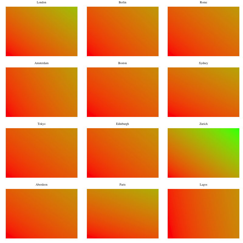
Heatmap of fares as a function of time and distance. I wanted this to be a bit more insightful in order to be able to compare all cities against each other across both dimensions but the extreme differences make it difficult to visualize. This highlights once more how expensive Zurich is compared to the other cities. The heatmaps below cluster the cities by the sum of price per mile and price per minute in order to visualize them along similar price scales.
Heatmap of the fares as a function of time and distance by city (1st quartile).
Heatmap of the fares as a function of time and distance by city (2ng quartile).
Heatmap of the fares as a function of time and distance by city (3rd quartile).
Heatmap of the fares as a function of time and distance by city (4th quartile).


