
What better way to celebrate running 1000 miles in 2013 than dumping the data into R and generating some visualizations? It’s also a step in my quest to replace Excel with R. I’ve included the code below with some comments as well as added it to my GitHub. If you have any ideas on what else I should do with it definitely let me know and I’ll give it a go.
PS. It’s great when web services allow users to export their data and wish more would start doing the same.
Cumulative distance. You can see a few flat areas in February and November when I took a break due to some minor injuries.
Distance run by month. Unexpected drop in November due to a break but pretty solid otherwise.
Distance run by week. Not much new information here that's not covered in the monthly graph.
Cumulative time. Very similar shape to that of cumulative distance.
Cumulative time vs distance. Superimpose one on top of the other to compare the shapes. Started off slowly but started getting faster in October.
Speed by run. I got significantly faster in October but slowed down again in December.
Speed by month by distance quantile. The idea here was to look at my improvement in speed but controlling for distance. Echoes the previous chart showing my speed improvement in Oct for the longer distances.
Speed distribution by distance quantile. Another view that looks at the distribution of my speeds for all runs in a given distance quantile. Not much here but I was expecting to see that I'd have a faster pace for shorter runs.
Speed vs Distance scatter plot. Another way to look at the relationship between speed and distance but not many new insights here. Slight correlation between speed and distance. This is pretty much because as I got faster I started doing longer runs. It'll be interesting to see how this changes in 2014.
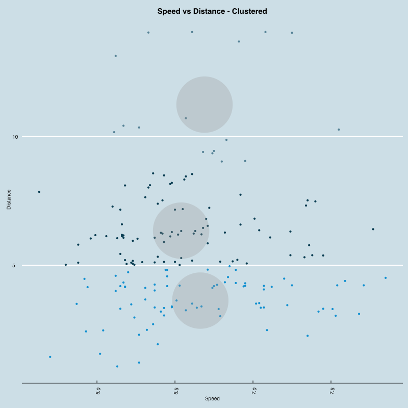
Speed vs Distance scatter plot clustered. An attempt at clustering the runs by speed and distance. In this case they were basically clustered by distance since the speed didn't vary significantly.
library(ggplot2)
library(grid)
library(gridExtra)
library(reshape)
library(scales)
library(lattice)
library(ggthemes)

data = read.csv("cardioActivities.csv", check.names=FALSE)

summary(data)

data <- data[order(data$Date),] # Sort ascending by date
data$ymd <- as.Date(data$Date)
data$month <- as.Date(cut(data$ymd, breaks = "month"))
data$week <- as.Date(cut(data$ymd, breaks = "week")) + 1
data$distance <- data$'Distance (mi)'
data$distance_total <- cumsum(data$distance)
data$speed <- data$'Average Speed (mph)'
data$time_hours <- data$distance/data$'Average Speed (mph)'
data$time_hours_total <- cumsum(data$time_hours)
data$time_mins <- data$time_hours * 60
data$time_mins_total <- cumsum(data$time_mins)
data$distance_total_norm <- data$distance_total/sum(data$distance)
data$time_hours_total_norm <- data$time_hours_total/sum(data$time_hours)
data$qs <- cut(data$distance, breaks = quantile(data$distance), include.lowest=TRUE) # Quantile data by distance run

# Generate a new data frame by qs and month to make plotting easier
data.qs_monthly <- ddply(data, .(qs, month), function(x) data.frame(distance=sum(x$distance), time_mins=sum(x$time_mins)))
data.qs_monthly$speed <- data.qs_monthly$distance/(data.qs_monthly$time_mins/60)

# Summarize the data by qs to make plotting easier
data.summary <- ddply(data,~qs,summarise,mean_speed=mean(speed),sd_speed=sd(speed),mean_distance=mean(distance),sd_distance=sd(distance))

# Cluster each of the runs by speed and data
m <- as.matrix(cbind(data$speed, data$distance),ncol=2)
cl <- kmeans(m,3)
data$cluster <- factor(cl$cluster)
centers <- as.data.frame(cl$centers)

# Normalize cumulative distance and time
data.normalized <- melt(data, id.vars="ymd", measure.vars=c("distance_total_norm","time_hours_total_norm"))
data.normalized$variable <- revalue(data.normalized$variable, c("distance_total_norm"="Distance", "time_hours_total_norm"="Time"))

png('rk-speed-vs-distance.png', width=800, height=800)
ggplot(data=data, aes(x=speed, y=distance)) +
  geom_point() +
  theme_economist() +
  scale_color_economist() +
  geom_abline() +
  theme(axis.text.x = element_text(angle = 80, hjust = 1), plot.title=element_text(hjust=0.5)) +
  xlab('Speed') +
  ylab('Distance') +
  ggtitle("Speed vs Distance")
dev.off()

png('rk-speed-vs-distance-clusters.png', width=800, height=800)
ggplot(data=data, aes(x=speed, y=distance, color=cluster)) +
  theme_economist() +
  scale_color_economist() +
  geom_point(legend=FALSE) +
  geom_point(data=centers, aes(x=V1,y=V2, color='Center'), size=52, alpha=.3, legend=FALSE) +
  theme(axis.text.x = element_text(angle = 80, hjust = 1), plot.title=element_text(hjust=0.5)) +
  xlab('Speed') +
  ylab('Distance') +
  ggtitle("Speed vs Distance - Clustered")
dev.off()

png('rk-speed-month-qs.png',width = 800, height = 600)
ggplot(data = data.qs_monthly,
  aes(month, speed)) +
  geom_line() +
  facet_grid(qs ~ .) +
  scale_x_date(
    labels = date_format("%Y-%m"),
    breaks = "1 month") +
  theme_economist() +
  theme(axis.text.x = element_text(angle = 80, hjust = 1), plot.title=element_text(hjust=0.5)) +
  xlab('Month') +
  ylab('Distance') +
  ggtitle("Speed by Month")
dev.off()

png('rk-distance-month.png',width = 800, height = 600)
ggplot(data = data,
  aes(month, distance)) +
  stat_summary(fun.y = sum,
    geom = "bar") +
  scale_x_date(
    labels = date_format("%Y-%m"),
    breaks = "1 month") +
  theme_economist() +
  theme(axis.text.x = element_text(angle = 80, hjust = 1), plot.title=element_text(hjust=0.5)) +
  xlab('Month') +
  ylab('Distance') +
  ggtitle("Distance by Month")
dev.off()

png('rk-distance-week.png',width = 800, height = 600)
ggplot(data = data,
  aes(week, distance)) +
  stat_summary(fun.y = sum,
    geom = "bar") +
  scale_x_date(
    labels = date_format("%Y-%m-%d"),
    breaks = "4 week") +
  xlab('Week') +
  ylab('Distance') +
  theme_economist() +
  theme(axis.text.x = element_text(angle = 80, hjust = 1), plot.title=element_text(hjust=0.5)) +
  xlab('Week') +
  ylab('Distance') +
  ggtitle("Distance by Week")
dev.off()

png('rk-speed-distribution-qs.png',width = 800, height = 600)
ggplot(data, aes(speed, fill=qs)) +
  geom_density(alpha = 0.5) +
  geom_vline(aes(xintercept=mean_speed), data=data.summary) +
  facet_grid(qs ~ .) +
  theme_economist() +
  theme(axis.text.x = element_text(angle = 80, hjust = 1), plot.title=element_text(hjust=0.5)) +
  xlab('Speed') +
  ylab('Density') +
  ggtitle("Speed Distribution by Distance")
dev.off()

png('rk-distance-cumulative.png',width = 800, height = 600)
ggplot(data=data, aes(ymd, distance_total)) +
  stat_summary(fun.y = sum, geom = "line") +
  scale_x_date(
    labels = date_format("%Y-%m"),
    breaks = "1 month") +
  theme_economist() +
  theme(axis.text.x = element_text(angle = 80, hjust = 1), plot.title=element_text(hjust=0.5)) +
  xlab('Month') +
  ylab('Distance') +
  ggtitle("Cumulative distance")
dev.off()

png('rk-speed-daily.png',width = 800, height = 600)
ggplot(data=data, aes(ymd, speed)) +
  stat_summary(fun.y = sum, geom = "line") +
  scale_x_date(
    labels = date_format("%Y-%m"),
    breaks = "1 month") +
  theme_economist() +
  theme(axis.text.x = element_text(angle = 80, hjust = 1), plot.title=element_text(hjust=0.5)) +
  xlab('Month') +
  ylab('Speed') +
  ggtitle("Speed by Run")
dev.off()

png('rk-time-cumulative.png',width = 800, height = 600)
ggplot(data=data, aes(ymd, time_hours_total)) +
  stat_summary(fun.y = sum, geom = "line") +
  scale_x_date(
    labels = date_format("%Y-%m"),
    breaks = "1 month") +
  theme_economist() +
  theme(axis.text.x = element_text(angle = 80, hjust = 1), plot.title=element_text(hjust=0.5)) +
  xlab('Month') +
  ylab('Time (hours)') +
  ggtitle("Cumulative Time")
dev.off()

png('rk-time-vs-distance-cumulative.png', width=800, height=800)
ggplot(data.normalized,
  aes(x=ymd, y=value, colour = variable, group=variable)) +
  geom_line() +
  theme_economist() +
  scale_color_economist() +
  theme(axis.text.x = element_text(angle = 80, hjust = 1), plot.title=element_text(hjust=0.5)) +
  theme(legend.title=element_blank()) +
  xlab('YMD') +
  ylab('') +
  ggtitle("Time vs Distance (normalized)")
dev.off()