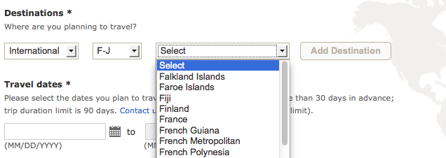
Before leaving for a trip to India, I wanted to make sure that I’d be allowed to access the ATM so I decided to contact my bank. Surprisingly, Bank of America was modern enough to allow me to do this online. Unsurprisingly, the UX was lacking.
Instead of just asking which country I was traveling to using a simple autocomplete or dropdown they have a three step process. First, I get to choose whether I’m traveling domestic or international. If internationally, I get presented with four options that are just the first letter of each country name. After choosing a country range bucket, I can finally pick the actual country.


I understand when an inferior UX decision is made because it’s cheaper to implement but in this case it must have actually been more difficult. Instead of having a single dropdown or autocomplete they have three different input elements. Even if the first selection is necessary, there’s no need to split 206 countries into 4 separate lists.
I’m not sure what I was expecting but it’s still frustrating seeing such decisions being made. I’d love to know the reasons.
