I don’t know why, but I’ve become more aware of the UI/UX of various sites and apps that I encounter. Whereas before I might have gotten frustrated about some behavior, I’m now starting to get annoyed whenever I encounter something that’s obviously crummy. Here’s a few of the more recent design anti-patterns I’ve been noticing.
- Submitting a login form with the wrong password removes the entered email address. Especially on mobile, where it both takes longer to type and typos are more common, it’s crappy having to type both my email and password again if I made a simple typo in my password or just don’t know which of my passwords I used. A quick hack I saw that makes this a bit easier is to add a keyboard shortcut to your phone to replace “@@” (or any other character set) with your email address.
- Confusing placement of sign in and register. I forget which app I saw this in but as you can screen from the screenshot I’m on the sign in screen and yet the button under the form is to register, which causes the app to load the registration screen. The sign in button is up top which is a confusing flow since the user goes down the page first before having to go back to the top. The fact that the app uses a flat UI makes this worse since there’s not a lot of differentiation between the sign in and register actions.

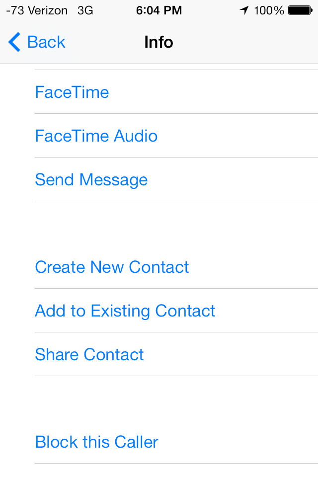
- Create new versus add to existing contact. This is probably the most “first-world” one here but without knowing who is currently in your address book it’s impossible to know whether you want to create a new contact or update an existing and contact. My current approach is to choose add to existing, realize that I actually don’t have that contact in my address book, and then go back a few screens and choose create new. A common database operation is “insert or update” - insert if it doesn’t already exist and update if it does. I’d love to have something like that to manage my address book.

