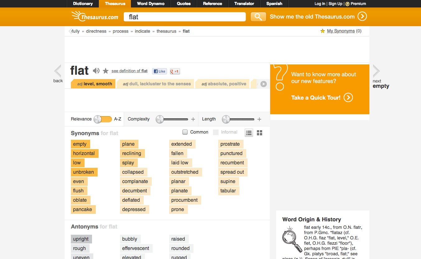
I don’t know whether it’s due to the upcoming version of iOS or Windows 8 but it feels as if flat design is getting more and more common. In the past couple of weeks, I’ve noticed two “mainstream” sites, Thesaurus.com and Optimum, adopt a flat design which I suspect is the first design change they’ve made in years. Many companies are updating their iOS apps in time for the fall release and I understand the motivation to want to fit the style but it’s interesting to see websites doing the same. I wonder whether we’ll see more sites adopting this flat design in the next couple of months.

