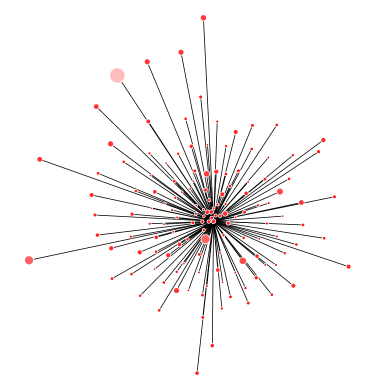
Something I’ve always enjoyed is messing around with data. For me, the first part has always been to plot the data to get a quick understanding of the dataset. Is there any obvious distribution visible? What are the data ranges? Are there any clusters that fit a known pattern? Does the data look clean or are there a ton of outliers? Does the data even make sense? Only then would I start the analysis and modeling piece.
At first, I’d just dump the data into Excel to generate various charts but moved on to using Perl and Python to generate charts when I learned the value of reusable code. While at Yodle, I picked up R which gave me more power than what I knew to do with and introduced me to a whole new set of visualizations and models. Recently, I’ve been having a blast using D3 and Vega. The biggest appeal is that they’re in Javascript so they can run in all modern browsers and make it very easy to support interactive behavior. The best analyses always tell a story and allowing users to interact with the data is a great way for them to craft their own story. I’m hopeful that such tools will improve data accessibility and get people excited about gleaning their own insights.
